Thursday, December 31, 2099
CLICK IMAGES TO ENLARGE
...I mean, only if you want to, of course. I'm not trying to force you to click on anything if you don't feel right about it.
Sunday, February 7, 2010
Fun With French Curves

Clearly, this one's ready for the Whitney Biennial of a a half-century or so ago! I'm not 100% sure of the tool employed; the line is too thick to be Bic Banana, but it's not a chisel-point, which rules out Magic Markers or El Markos. I can at least tell you that it's drawn on typing paper. I suspect this is actually a pen test, rather than a regression to a three- or four-year-old skill level; the rest of this pad of paper can be pretty conclusively slotted into the 1974-76 range (lots of Star Trek, no Star Wars), and there are other more coherent pieces involving this same French curve/protractor thingy.
Labels:
1975,
abstr,
drafting implements
Friday, December 25, 2009
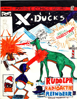
MERRY CHRISTMAS, ONE AND ALL!
This is about as late in the game as anything you'll ever see on this site, since, as a rule, teen-agers' art is as painful to look at as childrens' art is great. It's next to impossible to avoid a bad five years or so before you get your mojo back... and of course, for lots of folks, it never does come back. For boys, it's usually an ill-fitting obsession with the rendering of chrome, or abdominal muscles, or the particular curve of the spoiler on a 280-Z. For girls, it all turns into stiff horses with flowing manes and giant-headed doe-eyed girly men. Nowadays, the ubiquitous manga influence* lets clueless teens combine both these benighted aesthetics into a unified horror embraced by both sexes.
My work here is a late-to-the-party example of the duck craze seen in comics fanzine art in the late '70s, inspired of course by the popularity of Howard the Duck. I had certainly read and admired Howard by this point (not following it as it came out--I was a bit young for that-- but buying them from quarter boxes, from which they were then readily available). I'm not sure if I'd seen any of the fanzine stuff yet, since at this point I was only reading current issues of The Comics Journal and its less intellectually challenging little sibling, Amazing Heroes. I believe that this may have had its origins as a possible candidate for the latter magazine's regular "silly cover" feature, though I'm certain that I never actually submitted a black-and-white version for consideration. I do recall another attempt to create a submission featuring "Nick Furry, Agent of S.H.E.E.P.", based on this cover, but, again, I never submitted it and it's presumed lost.
The "Rudolph, the Radioactive Reindeer" character may have been conceived of prior to this piece; I definitely did a good number of drawings of him, as well as his springtime counterpart, the "Easter Beast". At some point after this, I renamed him"Randolph", since I'd decided that he was in fact a separate character. and not literally Robert L. May's beloved creation. I don't think I ever really tried to compose any stories featuring him, content to only draw "cool" action shots. Which brings us right back to paragraph one. Mea culpa!
*Before someone chimes in here, let me note that this is not a critique of manga, per se, so much as an observation that certain surface elements of popular manga styles intersect horribly well with seemingly-inborn teen badness. It's just a very effective template upon which a kid may construct doo-doo. Not that we don't have plenty of equally effective building blocks right here in the good old U.S. of A.
Thursday, December 24, 2009
TV Christmas Special (In SMELLOVISION!)
My grandfather at one point had a big stack of grey catalog envelopes that he used for organizing his business receipts, like the one pictured above. For whatever reason, I found them very pleasing as drawing paper, though this was obviously not the optimal application (I did at least use them to make a scrapbook for our vacation to Walt Disney world, binding them in a large checkbook binder so that each page was an illustration, with related postcards and other paper goods held inside the appropriate page... but generally, I was just wasting envelopes). This particular one is devoted to some sort of television program involving a dancing candy cane on stage (the cactusy-looking things are footlights). You may be asking "Why is the TV set is equipped with a special (labeled) 'Smellovision' attachment?" No amount of study of the drawing would lead you to any conclusions, and at this point, the physical object no longer bears any traces, but if you were in close proximity to the paper when it was new 31 years ago, you'd have smelled the peppermint-scented ball-point ink it was drawn with, from a pen similar to this:
...but with a green cap and no corporate logo. I'd provie a link to the site I stole the phptp from, but these are apparently discontinued, any way, so what's the use?
I really don't care for ball-points as a rule, but I really liked these pens... they smelled funny, the plastic had a very satisfying texture to chew on, and the cap was surprisingly sharp at its point. What more could one ask of novelty school supplies?
Sunday, June 7, 2009
Impromptu Yoda Costume


I believe that the impetus for this project was probably my acquisition of a stack of sheets of green foam rubber originally used as packing material at the Singer plant in Anderson where my grandmother worked. For whatever reason, one day it occurred to me that said foam rubber might be combined with a tank driver's cap from the army surplus store to create the fabulous headgear here depicted. The addition of a bathroom and my fabulous goat's hoof-tipped walking stick (hand-carved by my father several years earlier; it still exists, but is ludicrously short now that I've passed the three-foot line), and I was ready to offer up the ancient wisdom of the Jedi to all supplicants. I then posed for these photos and moved on to whatever mischief next called to me... likely one that involved swimming, fireworks, watermelon, or all of the above, since my memory is that this all occurred in late May or early June, not long after the movie came out.
Monday, September 22, 2008
Plagiarism
 ... of Joan Walsh Anglund, of all people! Although I can't seem to find a baseball player image of hers to compare it with, so it's possible that I'm actually attempting to do original work in her style, which is even nuttier. I've been racking my brain trying to figure out the lower image, and I've only just untangled it. I initially saw it as some sort of robot (or perhaps a space heater) on skis or rockers, but I now realize that I was looking at it from the wrong angle:
As goofy as it may seem, I was apparently drawing Darth Vader's TIE fighter with a baseball cap on it! I've flipped the wing and added the front window in blue to the above detail view, to more clearly illustrate my thesis.
Thursday, September 18, 2008
Mr. Mind Strikes Again!
 Those of you who haven't given me up for dead may recall this posting on my birthday back in April, where I drew Captain Marvel's famous arch-enemy, Mr. Mind, following instructions in an old SHAZAM! issue. In looking through a different notebook, I found another, simpler version, presented above. Comparing the two now suggests to me that the other one may have been done a year or so later than I previously believed, though it's possible that I may have just put more effort into the other one.
Actually, further investigation confuses the issue even further. I've just determined (between the two paragraphs) that this drawing is unquestionably from late summer/early fall 1977. So it's definitely the same age or newer, just more hastily drawn. So that's that.
Labels:
1977,
anthropomorphism,
entomology,
super-heroes
Thursday, June 26, 2008
Irish Snowman

As one might surmise from the various clues to be seen, this photograph was taken on St. Patrick's Day, 1971. I am a little over a month shy of my third birthday; my mother is 22. This is probably the first snowman that I had any direct participation in, and certainly the one I have the most vivid memories of (though that can probably be attributed to the existence of the photograph as much as any other factor).The eyes and buttons are radishes (a vegetable I otherwise have no tolerance for), the mouth is obviously carrot-based, and the hat is, I think, from Hallmark.
Other Fun Facts:
- This is the front yard of 139-A Cochran Road, where we lived from 1970-74.
- I still have a scar under my arm where I got pinched badly by shifting parts of the swing set in the background.
- The scarf and hat were particular favorites of my mother in those days; I still have said scarf, currently stored with my own seldom-used winter accoutrements.
Monday, May 19, 2008
The Ballad of Davy Crockett
 Click here to hear me and my new Realistic-brand Cassette Recorder. I don't yet know how close to hold the mike at this point, so it's even poorer quality than the equipment and tape would have dictated, but it is what it is.
Labels:
1975,
Disney,
music,
U.S. History
Friday, May 2, 2008
Collage Piece

Devlin Thompson
Waka! Waka! Waka! Waka!
Adhesive paper, enameled metal door
1979, 1981
ARTIST'S STATEMENT
In this piece, I have attempted to make a statement about world hunger through repurposing commercially available "bubble-gum card stickers" portraying popular actors and video game characters to create an imagined scenario in which "Pac-Man", having no access to the "power pellets" that constitute his/its normal diet, is forced instead to consume "Commander Adama." To subtly reinforce the food theme, I chose as my substrate an actual refrigerator door still in use at the time, so that the viewer would be forced to contemplate the image before every meal or snack. Not shown: several subsequent image groupings on the same door, involving "Spider-Man", an orange cow, "Blinky the Ghost" (famed nemesis of Pac-Man), and magnets displaying pictures of food and the telephone number of a local pizzeria .
Labels:
1981,
Battlestar Galactica,
collage,
mixed media,
Pac-Man
Subscribe to:
Posts (Atom)


